


Gone are the good old days when PCs were the only tools for sending mails, searching Google or interacting in social Medias like Facebook or Twitter. PC sales are steadily declining since 2001. Obvious conclusion is that more and more users are preferring smartphones, tablets etc. for internet uses. Sale of these items are increasing rapidly.
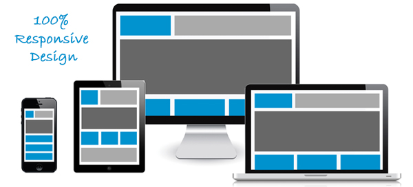
Use of different tools for website browsing generates the necessity for careful crafting of a website which will be compatible or usable and aesthetically pleasing through a wide range of devices. This is termed as responsive web designing. It uses a flexible and fluid layout which adapts and responds to almost every screen, small, medium or large in size.
While creating a responsive design site, one needs to build the site such that browsing experience is evenly the same among all the devices, be it small or large screen. That is even though the site’s appearance and visual structure is changed, content and functions should not be lost for changes in screen sizes or devices.
In order to ensure the same browsing experience by each devices like desktop, mobile or tablet, designer has to make sure that the image, content and grids are fully fluid. This will lead to effortless adaptation to the various screen sizes in existence. This is the true power of responsive web design and its changing the web design industry. Based on the size of the screen, the website will move, images will resize, contents will relocate, layout will be reoriented and even the navigation will adjust to create an awesome experience by user browsing the webpage from any location using any available device.
Multiple version of the website for different media is costly and cumbersome. Updating in such web pages also needs multiple efforts for different versions. Same is true for maintenance of these websites. With responsive web design, these extra efforts are completely avoidable. One need to update only one platform if it is designed following responsive web design procedure. This helps saving lot of time and money in the long run.
Another benefit for responsive web design is that one needs to optimize content for only one link. The URL structure doesn’t vary for different devices. It is therefore easy to update one URL and optimize the content.
For online sellers of goods and services, the Return on investment multiplies if the website follows responsive design practices. Because the customer is able to interact conveniently at any time, from any device and any location. Conversion is therefore considerably high.
Therefore, considering the benefits mentioned above, it is recommended to consider responsive web design for the new website development which will increase business and keep the website relevant for longer time.

 Germany
 India (Headquarter)